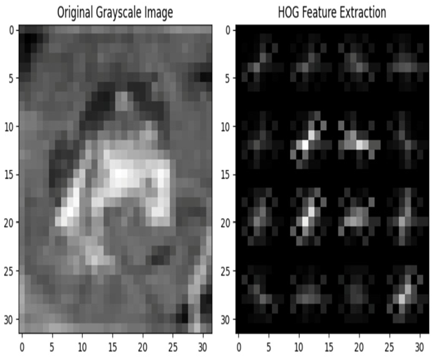
Feature extraction from an image dataset such as CIFAR-10 involves transforming raw image data into a set of relevant features that can be used as input for machine learning models. Here’s a simple example using the Histogram of Oriented Gradients (HOG) feature extraction technique:
import numpy as np
import matplotlib.pyplot as plt
from skimage.feature import hog
from skimage import exposure
from keras.datasets import cifar10
# Load the CIFAR-10 dataset
(x_train, _), (_, _) = cifar10.load_data()
# Select a sample image for feature extraction
sample_image = x_train[0] # You can choose any index here
# Convert the image to grayscale (optional)
gray_image = np.mean(sample_image, axis=2)
# Apply Histogram of Oriented Gradients (HOG) feature extraction
hog_features, hog_image = hog( \
gray_image,pixels_per_cell=(8, 8),\
cells_per_block=(2, 2), visualize=True)
# Plot the original image and its HOG representation
plt.figure(figsize=(8, 4))
plt.subplot(1, 2, 1)
plt.imshow(gray_image, cmap=’gray’)
plt.title(‘Original Grayscale Image’)
plt.subplot(1, 2, 2)
plt.imshow(hog_image, cmap=’gray’)
plt.title(‘HOG Feature Extraction’)
plt.tight_layout()
plt.show()
We get the following output:

Figure 4.8 – HOG feature extraction
Imagine you have a picture, and you want to understand what’s in the picture by looking at the patterns of lines and edges. HOG is a way to do that by focusing on the directions of lines and edges in an image.
In the preceding code block, the hog function internally performs the following four steps to generate the HOG image:
- Divide the image into small cells: First, the function takes the image and divide it into small boxes called cells. Think of these like little squares placed over the image.
- Calculate gradients: Inside each cell, we look at how the colors change. If the colors change significantly, it means there’s probably an edge or a line. We figure out the direction of this color change, and this is called a gradient. Imagine drawing little arrows to show the directions of these color changes.
- Group arrows into directions: Now, we group these little arrows with similar directions together. This is like saying, “Hey, there are a lot of edges going this way, and a lot of edges going that way.”
- Make a histogram of the directions: A histogram is like a chart that shows how many times something happens. Here, we make a histogram that shows how many arrows are pointing in each direction. This tells us which directions of edges and lines are more common in that cell.
In this section, we have seen how to visualize the image data and plot various features including color pixel histograms, grayscale images, RGB color channels, image segmentation, and annotations on images.
In the next section, we will examine the importance of image size and aspect ratio distribution in image data models.
Analyzing image size and aspect ratio
It is very important to understand the distribution of image sizes and aspect ratios in image data models.
Aspect ratio, in the context of image dataset EDA, refers to the proportional relationship between the width and height of an image. It’s a numerical representation that helps describe the shape of an image. Aspect ratio is especially important when working with images, as it provides insights into how elongated or compressed an image appears visually. Mathematically, the aspect ratio is calculated by dividing the width of the image by its height. It’s typically expressed as a ratio or a decimal value. A square image has an aspect ratio of 1:1, while a rectangular image would have an aspect ratio different from 1:1.
